Creating a more equitable job search
Duration: 2.5 week sprint
My Role: Lead UX Researcher; UX Designer; Point of contact with all users and Invisible Strengths stakeholders (CEO, COO, tech lead)
My team: Myself and three other General Assembly User Experience Design students
The client
Invisible Strengths, a social networking/jobs platform for public health professionals. Invisible Strengths aims to connect BIPOC/LGBTQIA and disabled job seekers with inclusive work environments.
The task
Invisible Strengths needs a mobile app prototype for the job seeker’s side: what will users see when they search for and apply for a job?
Deliverables
Market research, competitive and comparative analysis
Survey and user interview insights
User Persona and Empathy Map
User flows
2 rounds of usability testing and results
Client-facing annotated wireframes
Finalized clickable prototypes created in Figma
What I learned
How to prioritize key features
How to design for accessibility
How to lead communication about UX design with a client
Project overview
The challenge: which features to prioritize?
The founder of Invisible Strengths wants to build a job board with key features that set it apart from its competitors: on each job posting, the company must list all the disability accommodations that are available to employees.
The app will also have a social media element, along with an anonymous rating/reviewing feature, so that professionals can share useful behind-the-scenes information about workplaces and roles. On the employer’s side of the app, Invisible Strengths will provide tracing tools and tips for employers regarding reasonable accommodation for their potential employees.
Invisible Strengths has ambitious goals: salary transparency, disability accommodations transparency, job ratings/reviews, booking features for DEI consultants, tracing tips for employers, and more. The question for my team was this: which of these proposed features should we prioritize in our designs, to fit the needs of the I.S. audience?
The solution
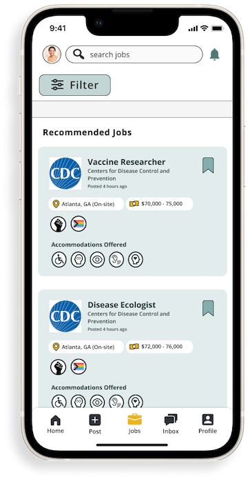
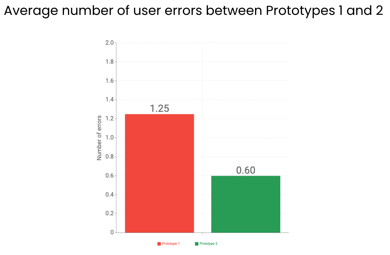
My teammates and I created a high-fidelity clickable Figma prototype of all the screens a user would see when searching for a job. Based on my user research, we prioritized highlighting salary ranges and disability accommodation transparency in the content hierarchy. User errors decreased by 52% between the first and second prototype, and during usability testing we received feedback that the prototype we’d created was easy to navigate and an exciting product.
See the prototype in action here, and read the case study below to see how I used generative and evaluative user research to build the final product.
Case study
The initial challenge: what are the audiences’s pain points?
Key survey insights from our target audience:
People feel that the disability accommodations offered by their companies are unclear
People fear being discriminated against due to appearance, ethnicity, disclosure of disability, or sexual identity
People feel that there is a disparity in their pay based on their identity, and because of that they have don’t know their worth
The next task was market research: what does the competitive landscape look like?
Market space:
My initial market research showed that Invisible Strengths is coming into the HR/recruitment tech space at a very hot moment: venture capital funding in HR tech doubled from July-November 2021, likely due to the pressure that the Great Resignation has put on employers to recruit, onboard and manage effectively. Total venture dollars in this area were $7.5 billion in 2021, compared to $2.2 billion in 2020, likely due to the pressure that the Great Resignation has put on employers to recruit, onboard, and manage effectively. (Crunchbase)
Demographic data
The unemployment rate for people with disabilities is twice as high that of those without: 9% compared to 4.4% as of September 2021 CNBC
According to the CDC, as of 2020 26% of adults in the United states (1 in 4) live with a disability. This number is likely much higher as of 2022, since long COVID is considered a disability under the ADA. HHS
Disability in the US intersects strongly with race and ethnicity: American Indian / Native Alaskans have the highest rates of disabilities in the U.S. (3 in 10), followed by Black Americans (1 in 4). CDC
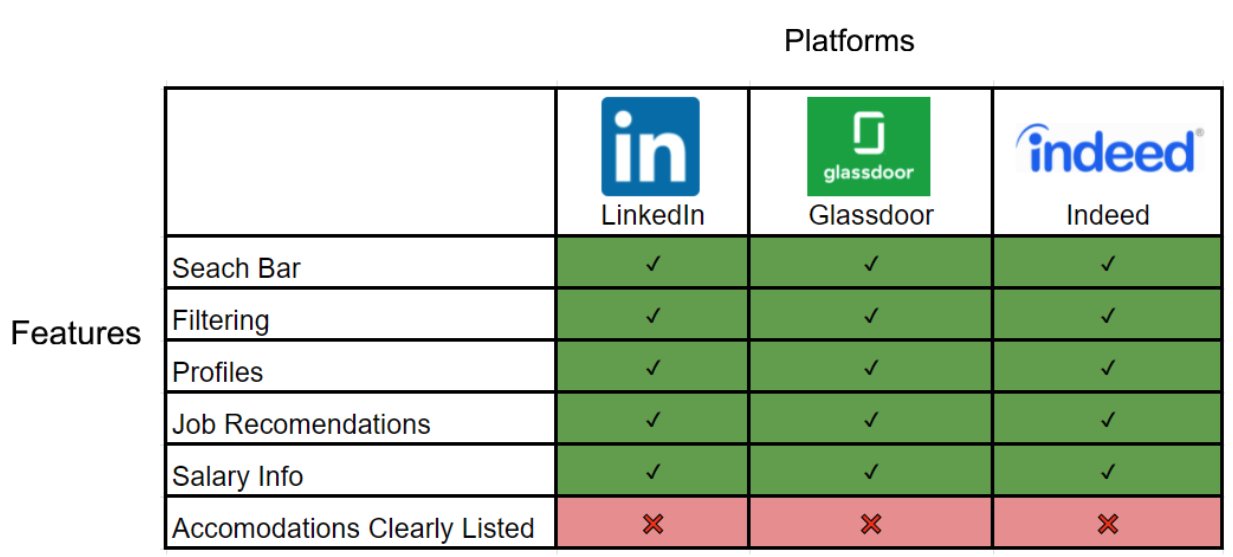
We also conducted a feature audit of Invisible Strengths’s main competitor platforms.
This helped us get a sense of the features Invisible Strengths would need to compete, and also where its competitors come up short.
See the full competitive and comparative analysis here.
The key market research takeaway was this:
Invisible Strengths has a unique value proposal at a moment when interest and funding are flowing into the recruitment/HR space. Its target audience has high unemployment rates and would benefit from an accessibility-focused app. And in the current job-seeker’s market, employers would benefit from access to a pool of skilled workers who are often shut out of the labor market.
Invisible Strengths’ competitors offer many of the same features that Invisible Strengths plans to offer to its audience. The area where Invisible Strengths can set itself apart is disability accommodations: there are currently no major jobs platforms that offer this feature.
Based one what we learned, we put together a User Persona to represent the user base of an app like Invisible Strengths.
This is an artifact created to help us as designers to visualize the audience we are designing for.
The User Persona was also developed for the client’s benefit, to help put a specific face to a large anonymous user base.
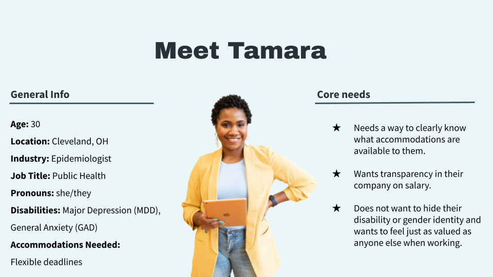
Reviewing our research and synthesizing it into a user persona helped crystalize our design goals: we knew that our app would have to prioritize accessible design, salary transparency, and highlighting available disability accommodations — with disability accommodations being the most prominent feature, since that is what sets the company apart from its competitors.
Creating the first prototype
Based on our research insights, we began our design process. We began with a design studio, then created our first prototype. Here’s a look at some of the design decisions we made based on our research.
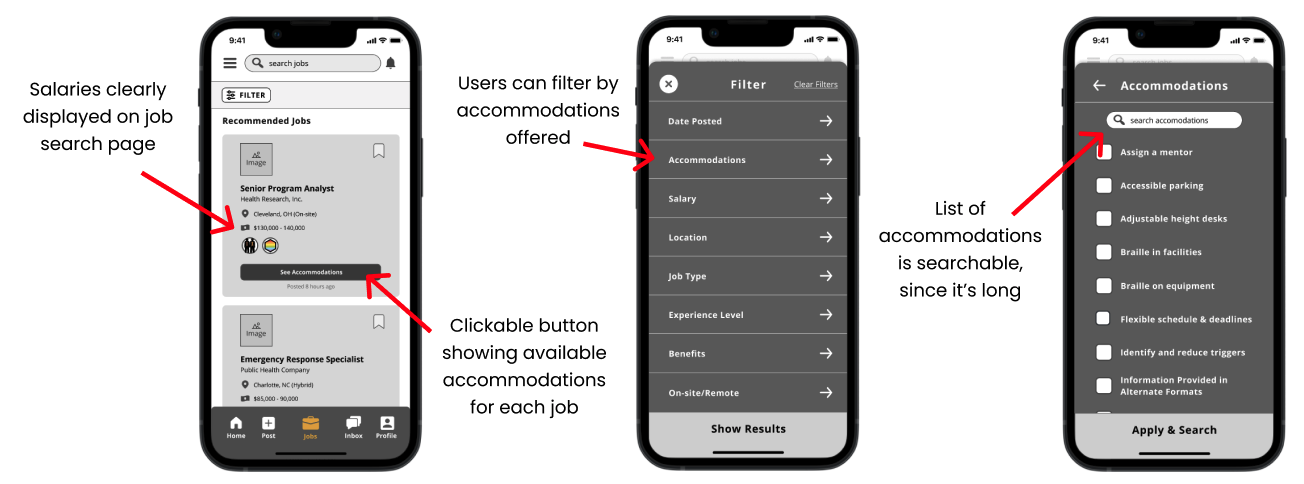
And here’s a look at our first prototype:
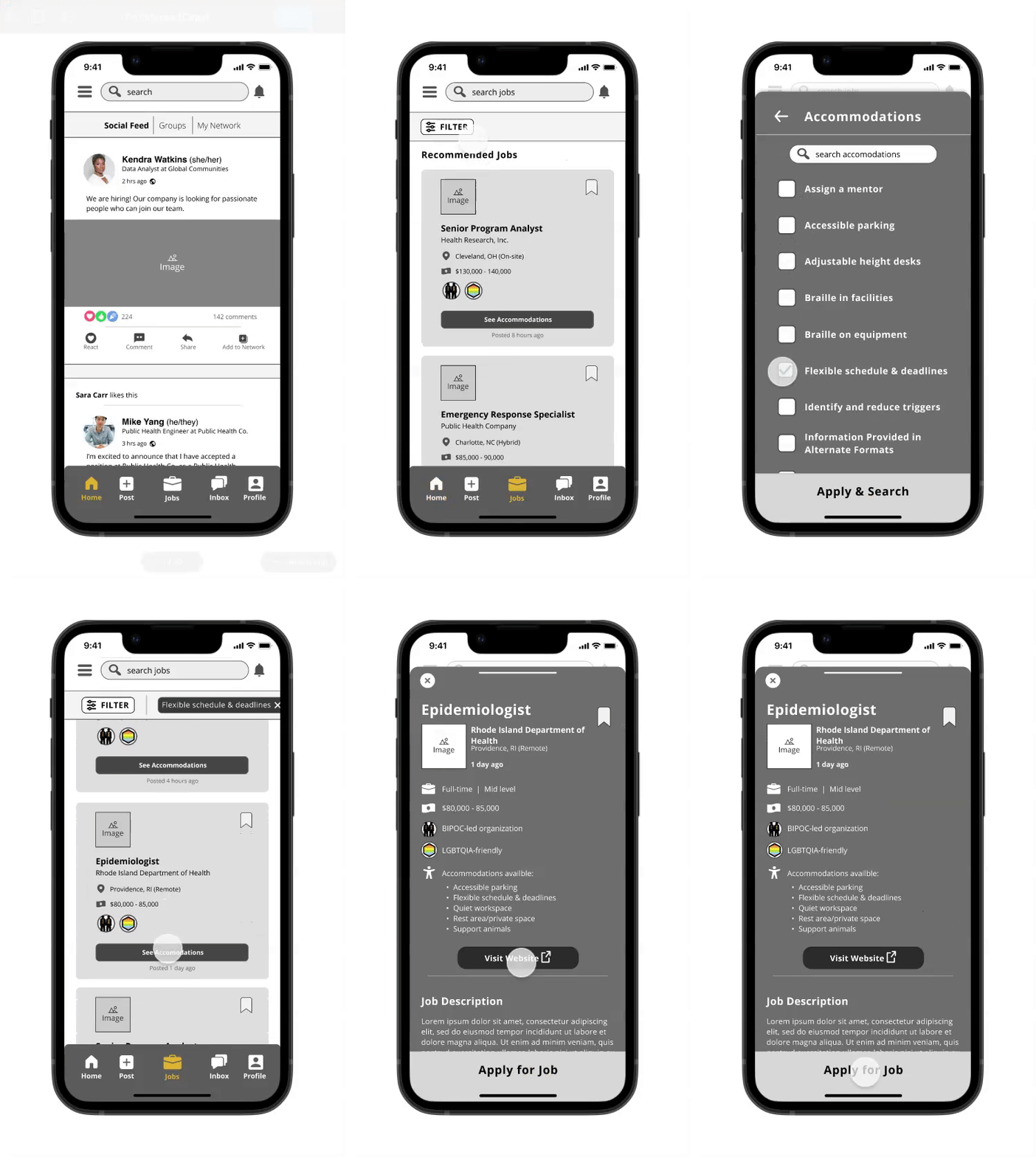
Now, the most important question: is the prototype usable?
Task scenario and heuristics:
For our first round of usability testing, we asked our users to find a full-time Epidemiologist job that provides the accommodation of flexible scheduling. (This is the task that’s being shown in the GIF above).
While we observed the users perform the task, we were looking for quantitative measures like the number of errors they made and the time it took them to complete the task. We also asked followup questions afterwards for qualitative data insights.
See the full goals, metrics, script and discussion guide for usability testing here.
Results from our usability test:
Users felt that the interface and task flow was in line with current industry standards.
On average, users made more than one error.
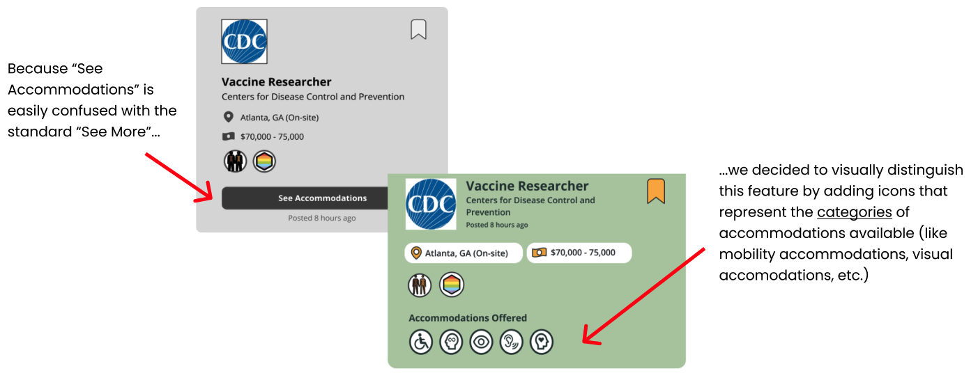
Users did not utilize the ‘See Accommodations’ button. One user stated that they believed it was simply a ‘see more details about the job’-type button. Users weren’t used to the idea of a pop-up with additional information.
See the full synthesis of usability testing data here.
After our first round of usability testing, I brainstormed with my colleagues about how to address the usability issues we were seeing. We knew we had to prioritize fixing the “See Accommodations” button, because our previous market research indicated that this feature would set Invisible Strengths a part from other platforms. Here’s a look at the design changes we made so that this feature would be more visible and usable:
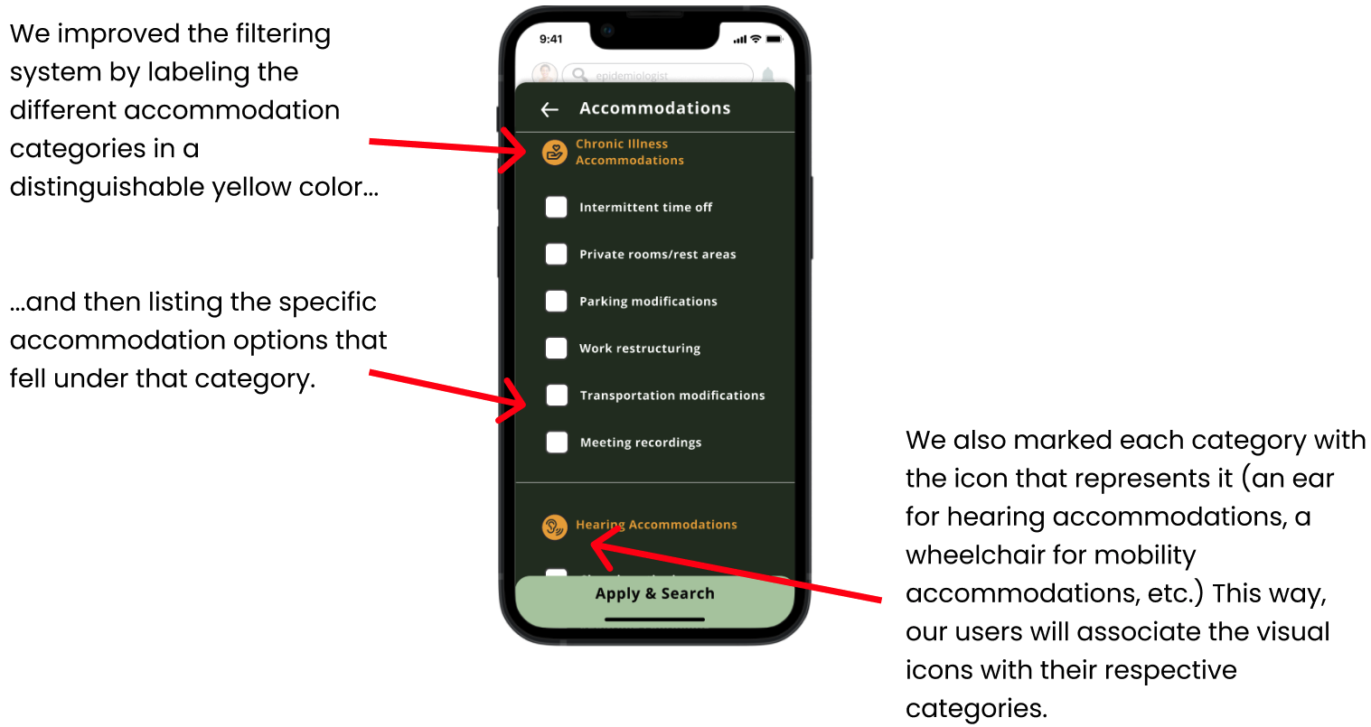
And because we established accommodation categories, we had to change our filtering system to reflect the new groupings.
Usability testing, round two
Once we made the changes listed above, along with a few others, we arrived at our second prototype and were ready to conduct our second (and final) round of usability testing. We asked six new users to complete the same task: find a full-time Epidemiologist job that provides the accommodation of flexible scheduling.
Here are the key insights from our second usability test:
Overall we got a positive reaction to our changes. The average number of errors was cut in half. This was really exciting!
Compared to the last prototype, more users saw and commented on the accommodations listed. This validated our design decision to add accommodation category icons.
Users were overwhelmed by the filtering options.
Users expressed that they wanted a way to ask for accommodations they didn’t see listed.
See the full synthesis of usability testing data here.
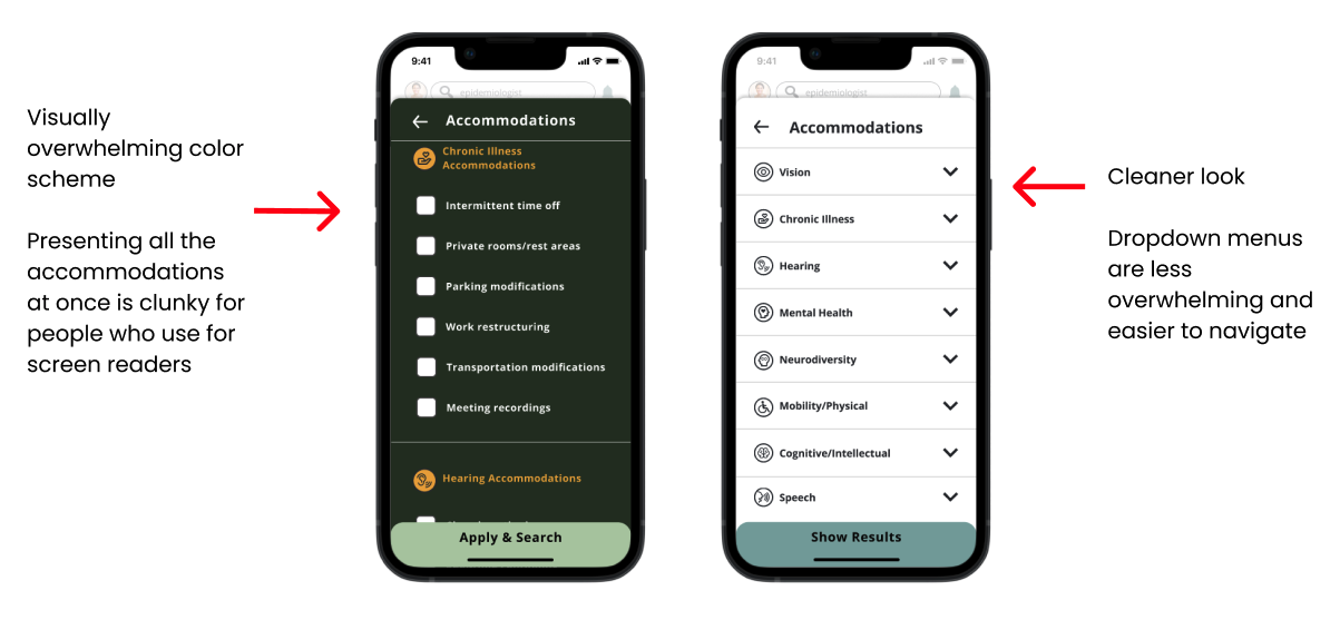
For our second prototype, usability had improved by both qualitative and quantitative metrics. There was just one persistent comment that we wanted to address in our final prototype: users were overwhelmed by the number of accommodations they were presented with when they clicked open that filter. To fix that, we made two key changes.
First, we did a UI redesign, focused on colors: going from the green palette we had been using to a more muted gray-and-blue toned one. This was done with accessibility in mind—by making sure it met WCAG accessibility AAA standards—and also to make the colors less visually overwhelming and to match the Invisible Strengths logo. Second, we implemented dropdown menus.
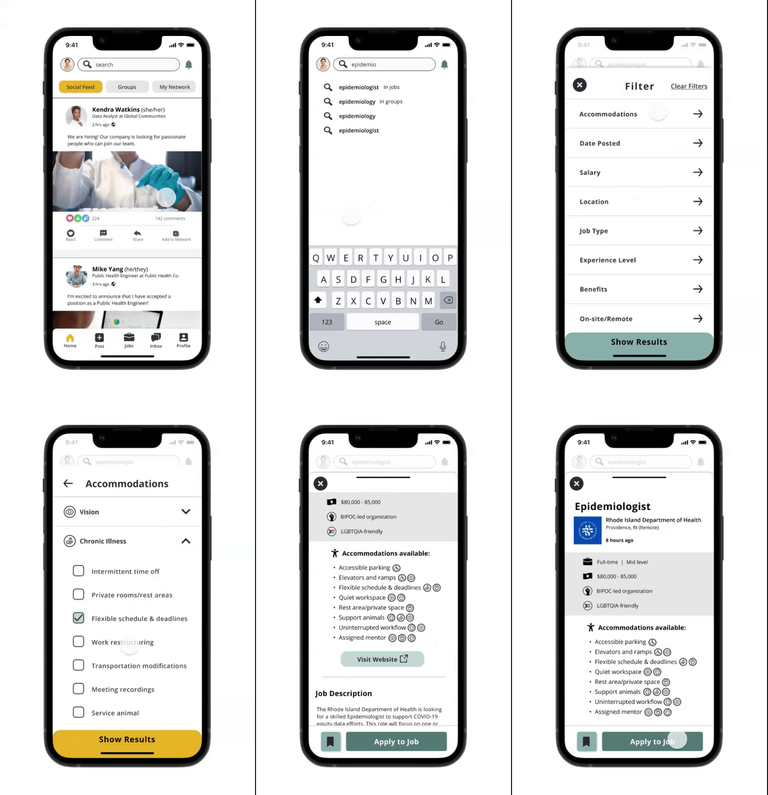
Once we’d implemented these changes, we arrived at our final prototype. Check it out below:
Potential next steps
After two rounds of usability testing and three prototypes, we arrived at the end of our sprint and handed off our deliverables to the client — market research, competitor analysis, a user persona, userflows, wireframes, a design library, and the final prototype. Here are the next steps we recommended to the client:
Conduct more discovery research on the value of the accommodations feature, to validate it and understand who it would be useful to and how
Create a feedback feature where job seekers can give feedback about accommodations they need but haven’t seen listed. In turn, the app would suggest that accommodation to employers as they post future job listings
Revise the accommodation icons used in the prototype to make them easier to understand on the fly
Do card sorting or other research to determine which accommodation falls under which category
What I learned
I honed my consulting skills through owning the communication with our stakeholders from beginning to end on this project. I educated the CEO (who had no previous UX background) and rest of the client team on the value of UX research and design throughout the project. I did this by leading hourlong weekly meeting syncs with the CEO and the rest of the client team, and tailoring my communication style to match the audience. My education resulted in the CEO praising my valuable explanations of the UX research and design.
This project also let me scratch my research itch: it was gratifying to create and administer surveys and interviews for dozens of people, and see where trends emerged. When I look at the final product, I can see where my research impacted our designs: in the foregrounding of the disability accommodations icons, the minimal UI design, and the dropdown menus.