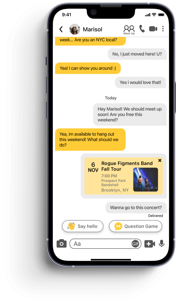
Helping you meet your match—IRL
The task
Design a new feature for Bumble to help the company meet a business goal (2-week concept challenge sprint for General Assembly User Experience bootcamp)
Project basics
Duration: 2 week sprint
My role: Lead UX Researcher; UX Designer
My team: Myself and three other General Assembly User Experience Design students
The client
Bumble is a matchmaking app for people seeking romantic partners, friends, or business contacts. The app’s uses a “swipe” model, where users sort through a deck of potential matches: once two users have mutually swiped each other, they match and can initiate a conversation. Bumble stands out for its female-first approach, where women are encouraged to make the first move.
The solution
My two teammates and I created a high-fidelity clickable prototype for “Bumble Meet-Ups,” a new feature located within the app’s chat, where users can browse local events and suggest them to their matches. See the prototype in action here.
I also wrote a Usability Test Report, which allowed me to dig in the data and see user trends clearly. The Usability Test Report contains the user interview discussion guides, synthesis of usability testing data, and more; see it here.
Design process
Market research, competitive and comparative analysis, user interviews, affinity mapping, wireframing, prototyping, usability testing
What I learned
How to use a combination of interviews and market research to assess the needs of a large customer base
How to pivot mid-project to fix UI issues that throw users off the happy path
The challenge: What is Bumble’s value proposition?
Our task for this project was to design a new feature for Bumble to help them meet a business goal; for us, that meant understanding what Bumble already helps is users accomplish, and where it falls short.
The first step was to get a sense of Bumble’s position in the market landscape.

Market Research
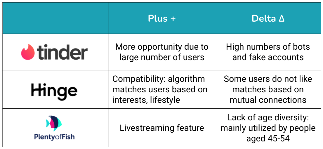
We first conducted comparative and competitive analysis, including a feature inventory.
User Interviews: who are Bumble users, and what do they need?
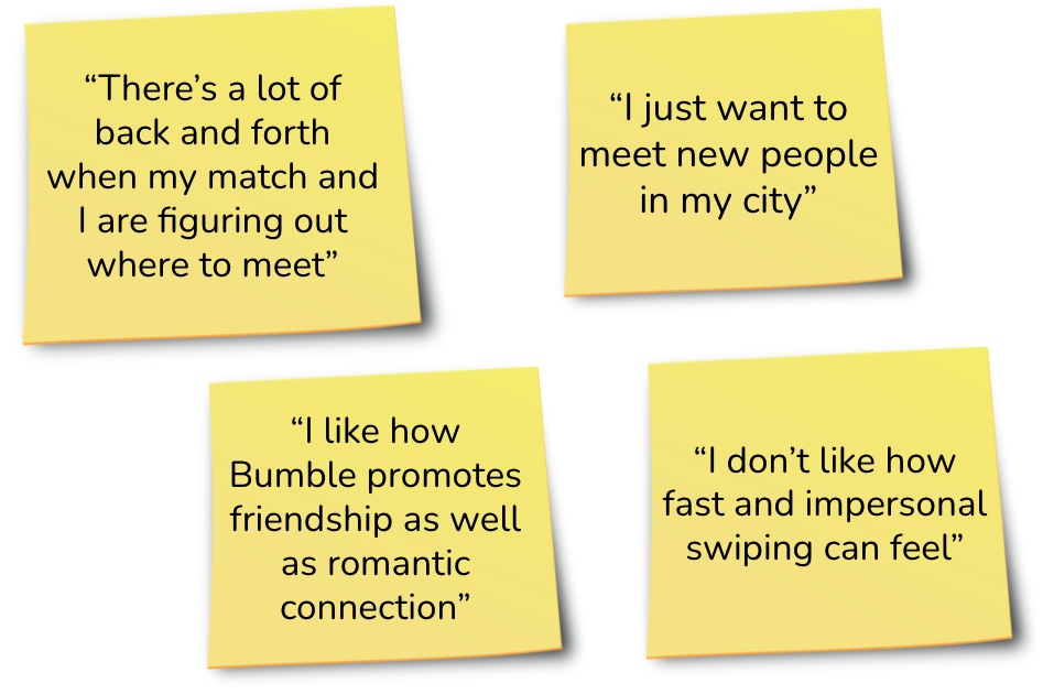
Though we’d analyzed Bumble’s position in the competitive landscape, we knew the information we could gather online was limited: we needed to speak to actual Bumble users to learn what their pain points were, and how they’d like to improve the app.
Here’s some of what we heard:
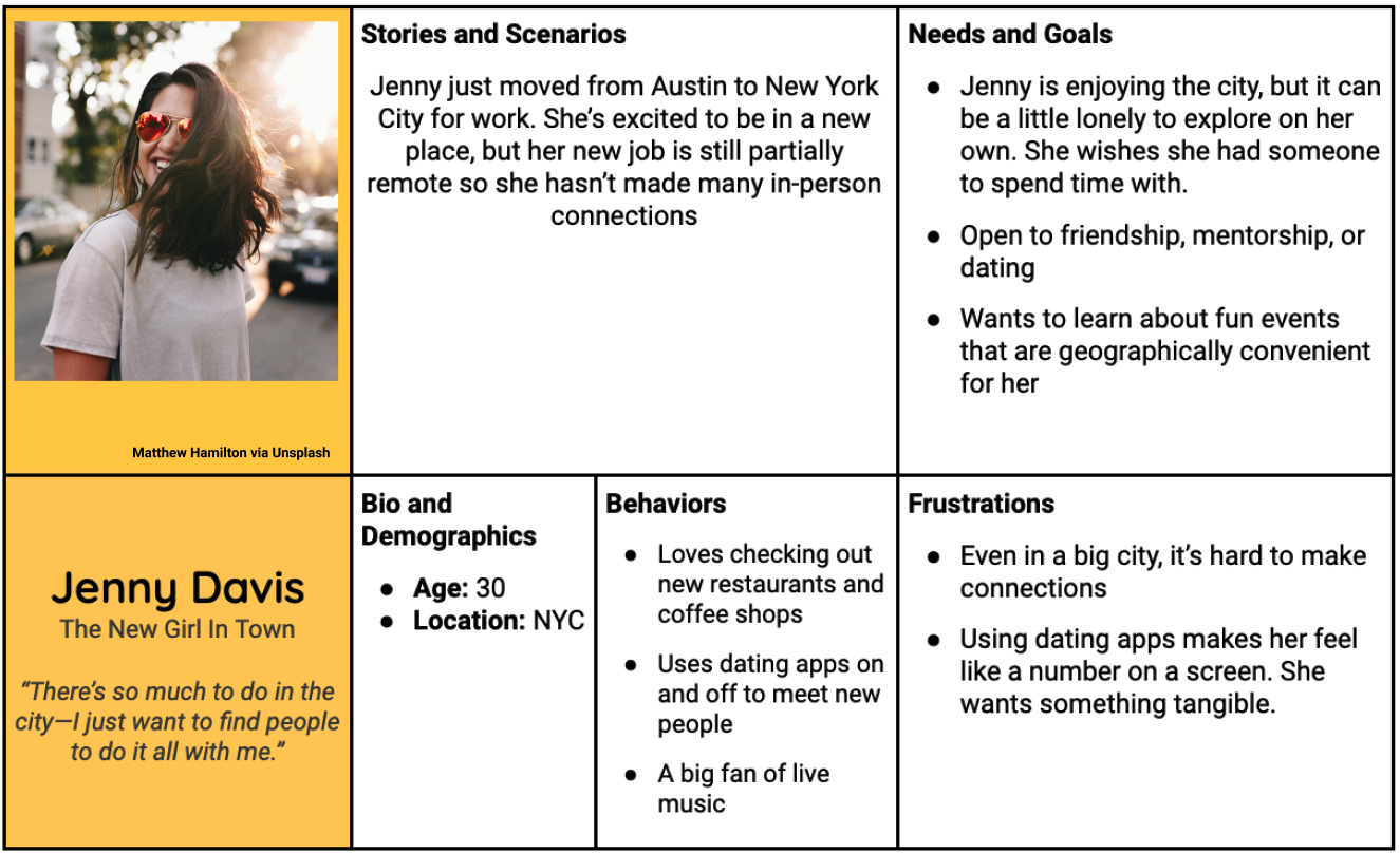
Based on our research, we created this User Persona to represent a typical Bumble user.
This is an artifact created to help us as designers to visualize the audience we are designing for. The User Persona was also developed for the client’s benefit, to help put a specific face to a large anonymous user base.
These were the takeaways from our market and user research:
Bumble’s “freemium” business model, where users can access some services for free, and others only by paying, relies on the value proposition that it can help its broad user base of young people find meaningful connections.
Many users want to jump from online conversations to in-person meetings.
Based on this, we came up with the following feature idea:
Hypothesis: Creating a feature that allows the user to discover a local activity, and suggest it to their match, will increase the number of users who are meeting in-person, which can help users make meaningful connections.
Business impact: Bumble’s value proposal is that it helps people create meaningful connections —whether romantic, platonic, or professional. Adding a feature that facilitates in-person meetings will elevate the reputation of the app as a tool to create connections.
Creating Meet-Ups
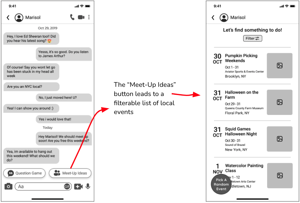
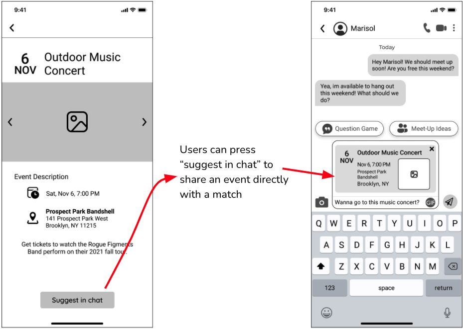
After a few rounds of brainstorming and sketching what our solution would look like, we landed on a “Meet-Up Ideas” button, located within the screen where Bumble users chat with their matches. We made the decision to place the button at the bottom of the frame, near the text field, because Bumble has other conversational prompts located there already, like “Question Game” (this turned out to be the wrong choice—more on this later!) We kept the style as close as possible to Bumble’s current app, so our new feature would be integrated seamlessly.
Here’s a look at our initial wireframes:
And here’s a look at our first prototype:
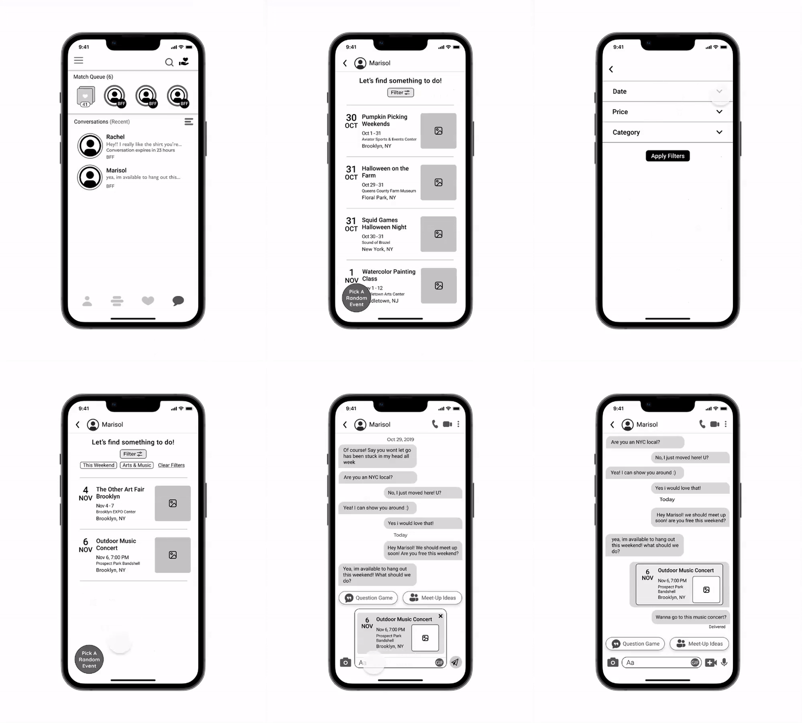
Once we’d built our prototype, we had to answer the most important question: is the prototype usable?
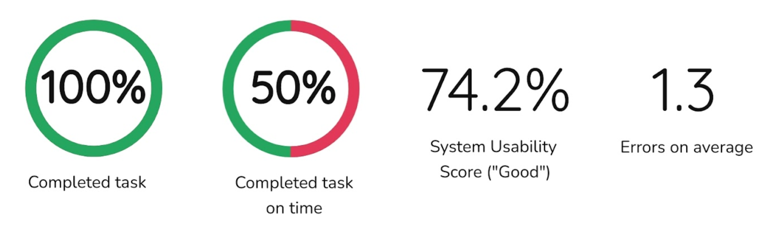
To answer this question, we conducted a round of usability testing. We recruited six people of various ages to complete the following task in the prototype: find a concert to attend this weekend, then suggest it to your match with a personalized note. On our end, we watched our testers to see how many errors they made, where they hesitated, and whether they could complete the task within 1 minute and 34 seconds
For this task, I created the usability testing metrics and discussion guide; they can all be found in more detail in the Usability Testing Report I wrote.
Usability testing results, Round 1
Here’s the quantitative data at a glance:
And here’s some feedback we heard, over and over, about specific screens:
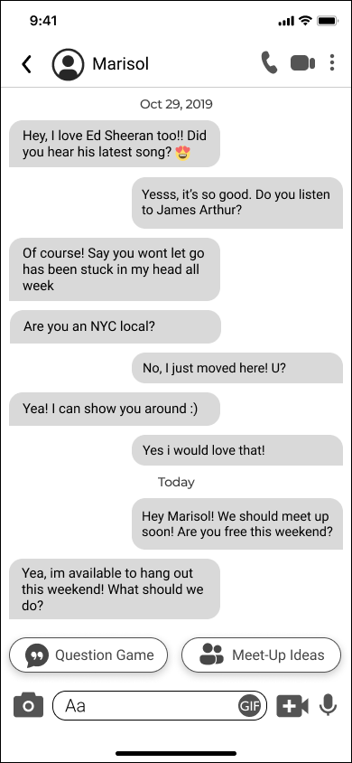
“Where do I click?”
Users took a long time to find the “Meet-Up Ideas” button, and made errors along the way.
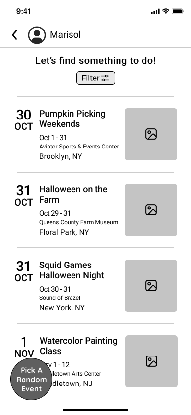
“Am I seeing all the events happening near me, or just some of them?”
Users wanted more clarity about whether they were seeing a curated events list or a comprehensive one.
Iteration
After the first round of usability testing, I sat down with my teammates and tried to figure out what had gone wrong with the Meet-Up Ideas button placement. We knew the feature’s discoverability was the most important factor in our prototype, and that’s where most of our users were stumbling. The small size and location of the button made it easy to miss: one user even said that they associated the button’s location with “spammy” text autofill prompts they were used to seeing in in customer-service chats.
Based on this feedback, we tinkered with the button placement for a while, but couldn’t figure out how to fix the issue. Our lightbulb moment happened when we zoomed out and thought big-picture about Bumble’s business goals, not just our own goals as designers. If Bumble were to spend resources building out an exciting new feature like this, it would likely spotlight the feature at a higher level than just a tiny suggestion at the bottom of the chat screen — it could be placed within the main navigation header within chat, and given it some prime real-estate on the screen. We also thought that to increase buy-in, Bumble could create a temporary promotional overlay to introduce users to the new feature.
Here’s a look at the changes we made based on Usability Testing feedback:
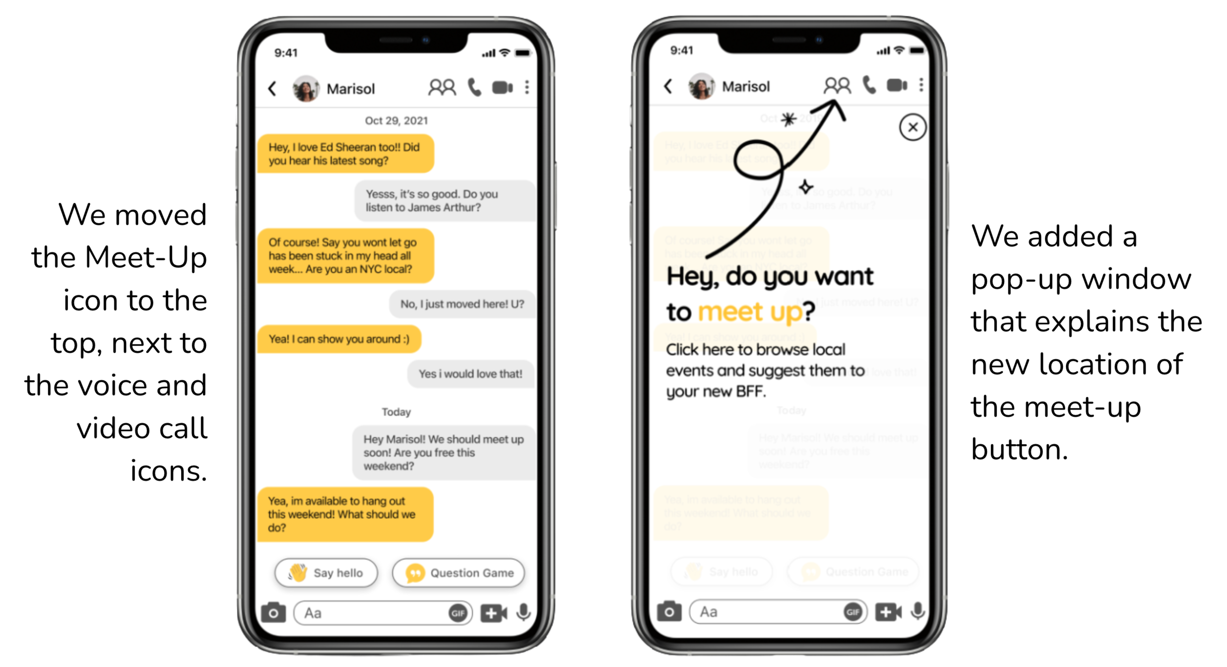
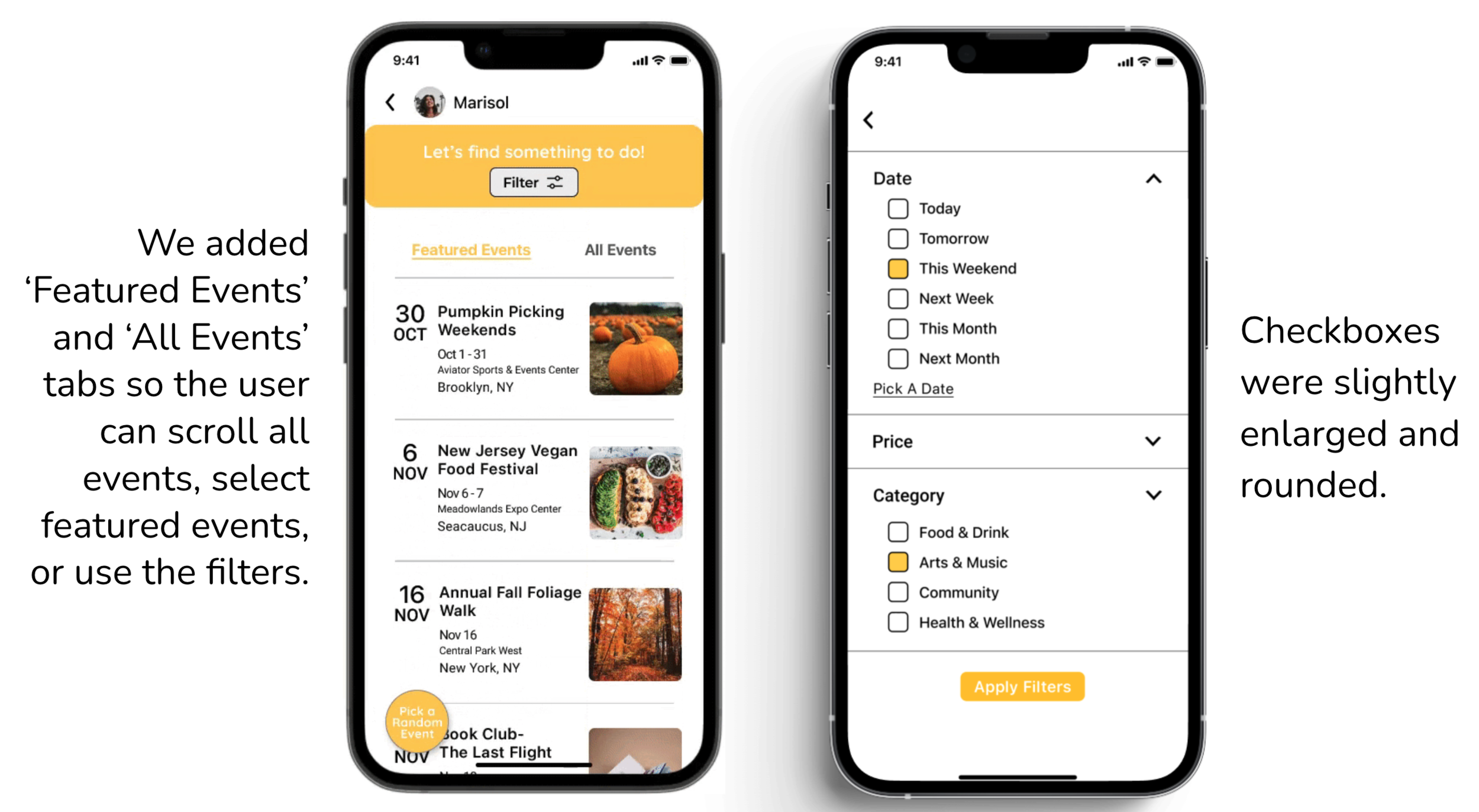
This led us to our final prototype:
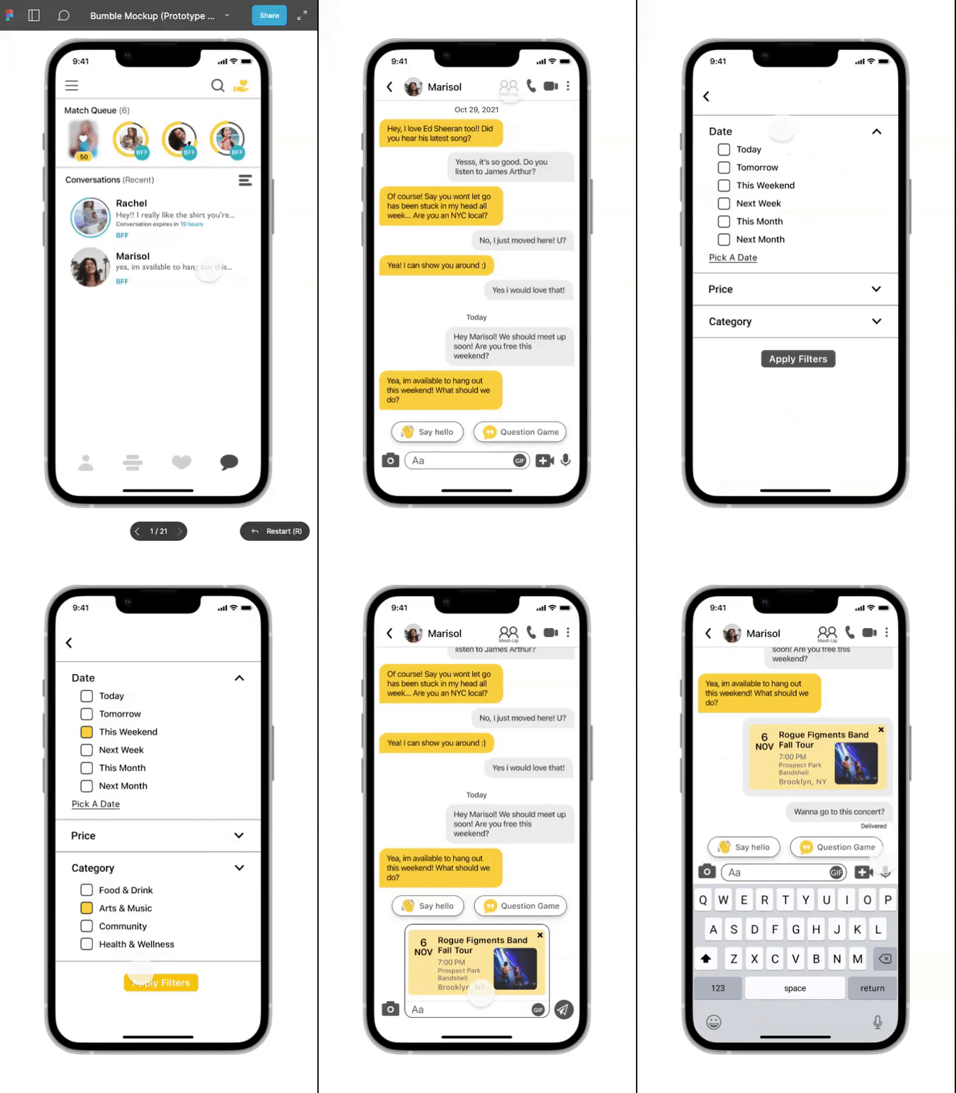
Usability Testing Round 2: how did the second prototype compare to the first?
Now that we’d arrived at our final prototype, we needed to do another round of testing. Six new testers were given the same task as the first set of testers: find a concert to attend this weekend, then suggest it to your match with a personalized note.
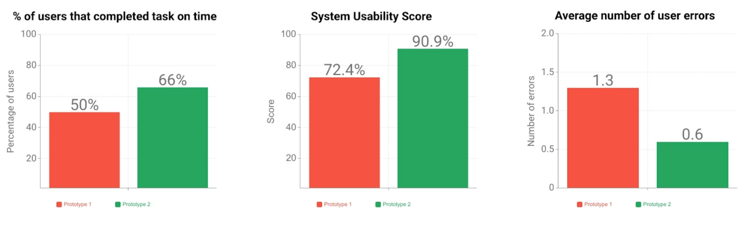
...Success!
Across the board, usability improved between the first and second round of usability testing: time spent on the task decreased, the System Usability scale score rose from “Good” to “Excellent,” and we were able to cut in half the average number of user errors ( more details and analysis can be found in the Usability Testing Report I wrote).
Not everything went perfectly, though. Even though the second prototype got better usability scores than the first one, users still spent a significant amount of time and clicks before finding the Meet-Up feature. Though the scope of our project ended here, we came up with three strategies to highlight the Meet-Up feature to improve its usability:
Phased rollout: Bumble could add a small text label to the Meet-Up icon, and then (after a few months) phase it out as users become familiar with the feature
Onboarding: When users sign up for Bumble, a highlight on Meet-Up could be included as part of the introductory instructions
Marketing: In any marketing campaign(s) highlighting the Meet-Up feature, the same two-person symbol that represents it in the app could be prominently displayed
Conclusion
This was my first opportunity to work with a team and do group design studios, where we all sketched ideas for the prototype and converged to figure out which looked and worked best. It was illuminating to get a peek into other designers’ brains, and taught me to explain my design decisions to a team.
This project also let me really dig into content hierarchy for the first time. The fact that our Meet-Up button, which we had thought very carefully about where to place, was skipped over or not seen by many of our usability testers really drove home for me the phrase “the designer is not the user” and the importance of usability testing/interviewing to understand people’s motivations.